
Wacky Why's
Why is Color Important in Kids' Spaces?
June 8, 2026
If you've ever walked into a space and instantly felt calm, excited, cozy, creative, or energized, color probably had something to do with it.
Long before we notice the furniture, artwork, or architectural details, our brains are already responding to color. It influences how we experience an environment and helps shape the emotions we associate with a space.
That's why color plays such an important role in themed environments, children's ministry spaces, pediatric healthcare facilities, schools, museums, and recreation centers. When used intentionally, color can encourage curiosity, support storytelling, guide attention, and help create memorable experiences.
So why is color important in kids' spaces?
Because color helps transform a room from a place people simply occupy into a place they actually experience.
How Color Influences Mood and Behavior
Color does much more than make a space look attractive.
Different colors naturally create different emotional responses. Warm colors like red, orange, and yellow tend to feel energetic, playful, and inviting. Cooler colors like blue and green often feel calming, peaceful, and restorative.
Brightness matters, too. Highly saturated colors can create excitement and draw attention, while softer, muted tones can help an environment feel more relaxed and balanced.
Color can also help guide people through a space. Designers often use contrast to create focal points, highlight important features, or support the story an environment is trying to tell.
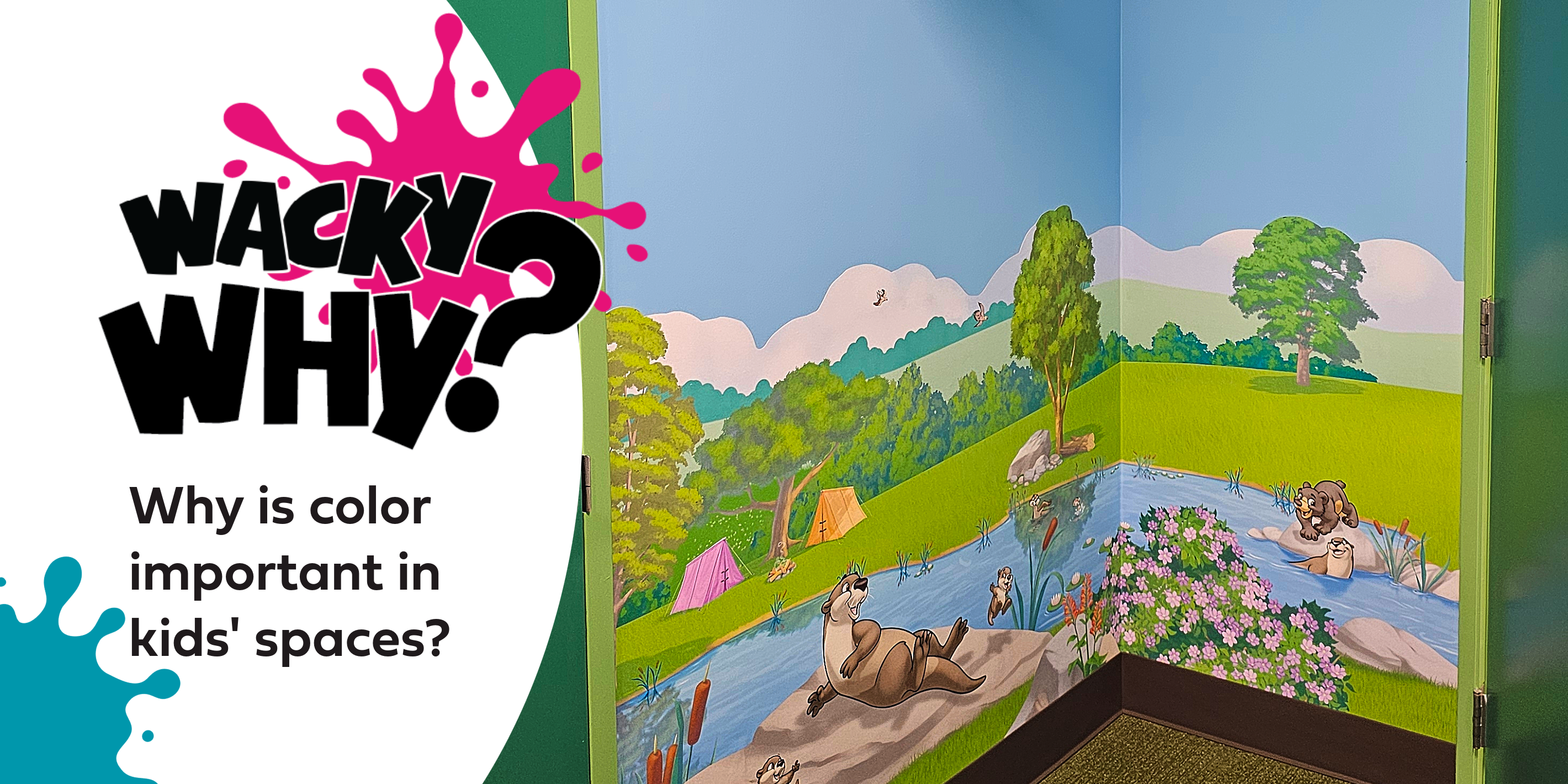
A jungle-themed environment, for example, might use rich greens with bright tropical accents to create a sense of adventure and discovery. An underwater-themed space may rely on blues and teals to create a more immersive, calming atmosphere.
The goal isn't simply to add color.
The goal is to create the right feeling.
Why Kids Respond So Strongly to Color
The interesting thing about color theory is that it applies to everyone.
Adults respond emotionally to color just as much as children do. Bright colors still create excitement. Soft colors still create comfort. Warm colors still feel inviting. Cool colors still feel calming.
Kids, however, often respond to those feelings more instinctively.
Adults may walk into a room and notice whether it feels modern, polished, or stylish. Children are more likely to react emotionally. They notice whether a space feels fun, exciting, imaginative, welcoming, or adventurous.
That's one reason themed environments can be so powerful for children. Color helps support storytelling, exploration, creativity, and engagement in ways that feel natural and immediate.
A well-designed children's space isn't just visually appealing.
It invites participation.
Where Have all the Colors Gone?
At the same time, it's hard not to notice how much modern design has shifted toward neutral palettes.
Take a look around a parking lot and you'll probably see a lot of white, gray, black, and silver vehicles. New homes often feature neutral exterior colors and muted interior palettes. Restaurants, offices, and public spaces frequently embrace minimalist aesthetics, natural materials, and industrial finishes.
There's a reason these trends became popular.
Neutral spaces can feel sophisticated, timeless, calming, and easier to coordinate. In a world that already feels busy and overstimulating, many people appreciate environments that feel quieter and more controlled.
And there is absolutely nothing wrong with that.
The challenge comes when every space begins to feel the same.
Especially spaces designed for children.
Why Neutral Adult Spaces and Colorful Kids' Spaces Work so Well Together
One of the biggest misconceptions in design is that you have to choose between a modern aesthetic and a colorful children's environment.
In reality, the two often work better together than they do apart.
Imagine a modern lobby with warm wood tones, clean lines, and neutral finishes. Now imagine a vibrant themed children's area connected to that space.
The contrast immediately creates visual interest, but it also does something more important.
It communicates that this area was created specifically for kids.
When children move from an adult-focused environment into a space filled with color, murals, storytelling elements, and playful design, it feels different. It feels welcoming. It feels exciting. It feels like a place where they belong.
That transition can be incredibly powerful.
Rather than competing with each other, the spaces support each other. The neutral areas provide balance and sophistication, while the colorful areas create energy, imagination, and memorable experiences.
It's one of the reasons this approach works so well in churches, schools, libraries, museums, pediatric healthcare environments, and family entertainment centers.
Color Doesn't Have to Mean Chaos
Another common misconception is that colorful automatically means overwhelming.
Good themed design doesn't rely on throwing every color imaginable into a room. In fact, the most successful environments are often carefully balanced.
Some areas are designed to capture attention. Others are intentionally quieter. Bright focal points are supported by more subtle surrounding colors. Contrast is used strategically rather than constantly.
Thoughtful color design creates energy where you want it and calm where you need it.
That's the difference between decoration and design.
The Goal Isn't More Color
The goal isn't to make every wall brighter or every room louder.
The goal is to use color intentionally.
Great themed environments use color to support stories, shape emotions, guide attention, and create experiences people remember. Sometimes that means bold, vibrant palettes. Sometimes it means carefully placed accents within an otherwise neutral space.
Either way, color is doing more than decorating the room.
It's helping create the experience.
And that's why color matters.
Frequently Asked Questions About Color in Kids' Spaces
-
Why is color important in children's spaces? Color influences mood, attention, creativity, and engagement. It helps create environments that feel welcoming, stimulating, and memorable while supporting the overall goals of the space.
-
Do bright colors always work best in kids' spaces? Not necessarily. Effective children's environments typically balance brighter focal colors with calmer supporting tones. Too much visual stimulation can be just as problematic as too little.
-
Can colorful kids' spaces work with modern design? Absolutely. Neutral adult-focused environments and colorful children's spaces often complement each other. The contrast helps create a clear sense that the children's area was intentionally designed just for them.
-
What is color theory in themed environments? Color theory is the study of how colors interact and how they influence perception, emotion, and behavior. In themed environments, color theory helps designers create spaces that support storytelling, mood, engagement, and wayfinding. Learn more with our Wacky University course on The Power of Color in Immersive Theming for Children's Spaces. Or for a lighter take, check out the article from our ABC's of Theming series: C is for Color Cues.
If you can dream it, we can theme it!
This article was co-written with human creatives and AI tools. Photo/video credits: Wacky World Studios, Charles Coleman Photography, and Special Care, Inc.